Coefficient, a design system built for SAP’s enterprise-ready commerce solution, was engineered with the idea of being as efficient and scalable as the SAP platform itself. The SAP Commerce Cloud platform allows organizations to spin up a new commerce environment easily and efficiently; however, from the UX and design side, development of flows and prototyping can become redundant from client to client. This problem led to the opportunity to create a product that can be reused and allows clients to not only see changes to theming in real-time, but also allows them to see progress sooner, encouraging for more collaboration and feedback cycles.

Before beginning on the development of the design system, research was needed to see what user flows were typically presented and what pages were focused on the most by clients. Pouring through a number of SAP Commerce Cloud projects revealed a handful of consumer facing and B2B specific pages that were used across most integrations.
With this information in hand brainstorming a plan of action for what UX and design teams needed most became easier.


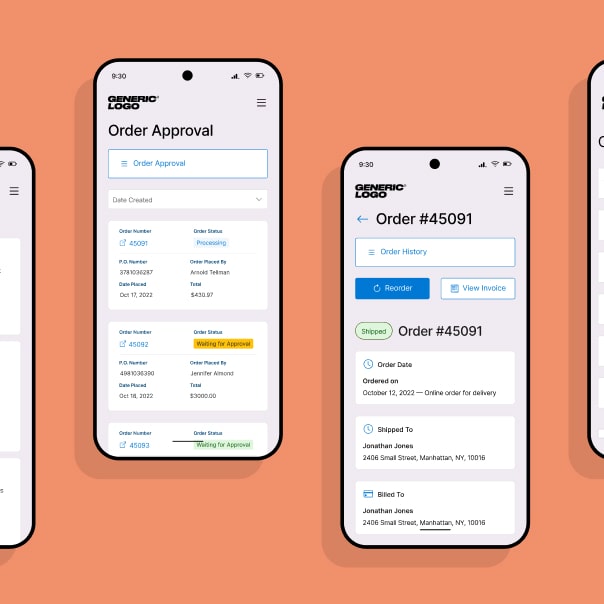
Utilizing Figma, the pages identified during research were plotted out into four device sizes: mobile, tablet, laptop and extra-large desktop. This ensured that any components made would scale responsively across major breakpoints. The design system itself was then seperated into three categories: foundations, components and pages.
In each page section lives a master component, an area that houses the main body of the page. UX teams were then able to add, remove or swap out components as necessary. Modifying the master component ensured that the changes translated to each one of the device sizes that were positioned next to it, meaning that one modification was reflected across all devices, therefore reducing work by 4x.
Since the master component was kept separate from the device layouts, the global page animations and prototypes could be used from project to project. This meant setting it up once, further reducing the time spent setting up prototypes for presentations.


Once UX is completed and the project is handed off to the design team, another reduction in time is achieved by updating the foundations with the client's brand colours and fonts. This update has a ripple effect across all components, allowing the design team to focus on the larger visual changes that make the project unique for the client.