
Brand
/
eCommerce
/
Design Systems
BorderStates
(
6
)
/ About the project
Border States redefined its brand positioning with the tagline For the Unstoppable, emphasizing its role as a trusted partner in the construction, industrial, and utility sectors. To support this new strategy, a cohesive visual and design system was developed, ensuring consistency across its eCommerce platform and customer portals.
The new system incorporated a flexible set of graphic devices inspired by the company’s logo, along with a refined color palette, iconography, and typography. A scalable design system was implemented to maintain brand alignment across all touchpoints, reinforcing Border States’ bold and dependable identity while enabling adaptability for future growth.


/ A strategy for the unstoppable
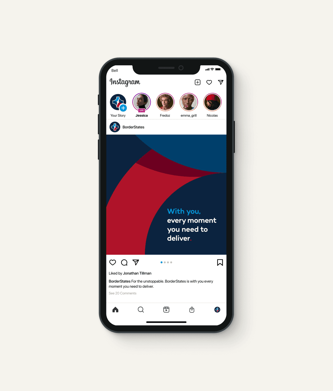
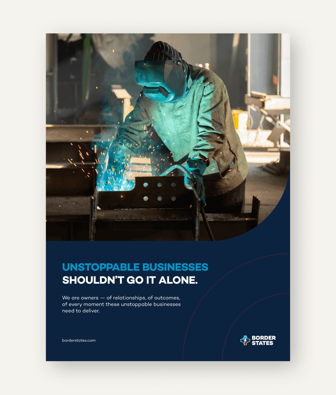
Border States, one of America’s largest 100% employee-owned companies, began working on a new positioning strategy for their brand. The strategy focused around the idea that Border States was an extension of their customer's team. A trusted partner with all the supplies, services and knowledge to get tough projects completed on time. This was eloquently summarized by the new tagline: For the Unstoppable.
To complement the new strategy, Border States wanted to update their current eCommerce site and all additional portals to ensure a cohesive look. This led to creating a visual system along with a design system to ensure consistency.
/ A flexible visual system
The quality of Border States services required a visual system and design system that was robust enough to match. In total six graphic devices were created that were flexible enough to respond to multiple ratios and website breakpoints. A new colour palette, iconography set and typographic stack were also added. This robust set of visuals were all created with the idea of being bold, responsive and impactful. The visual equivalent of the new Border States tagline.
/ A logo inspired system
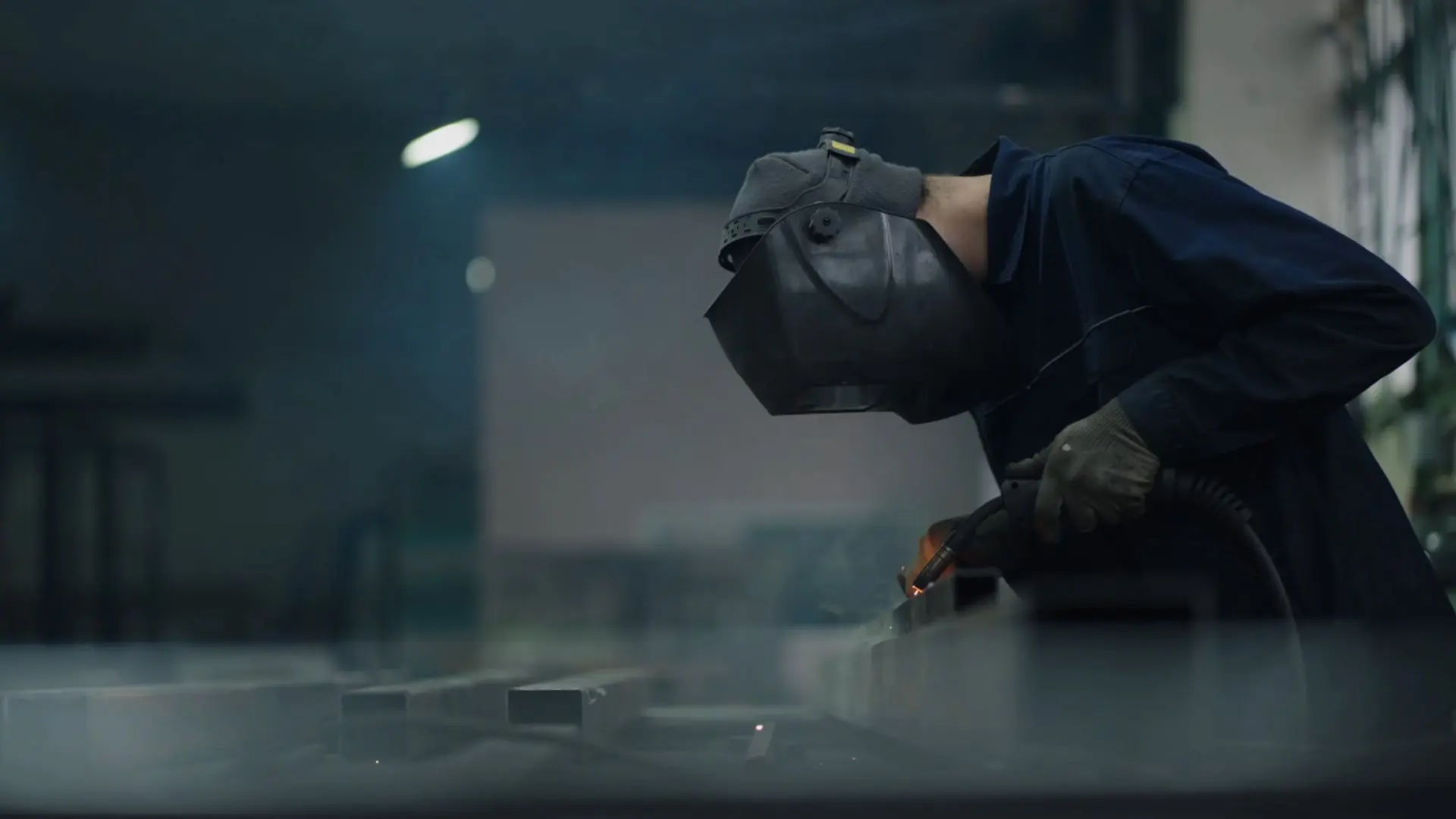
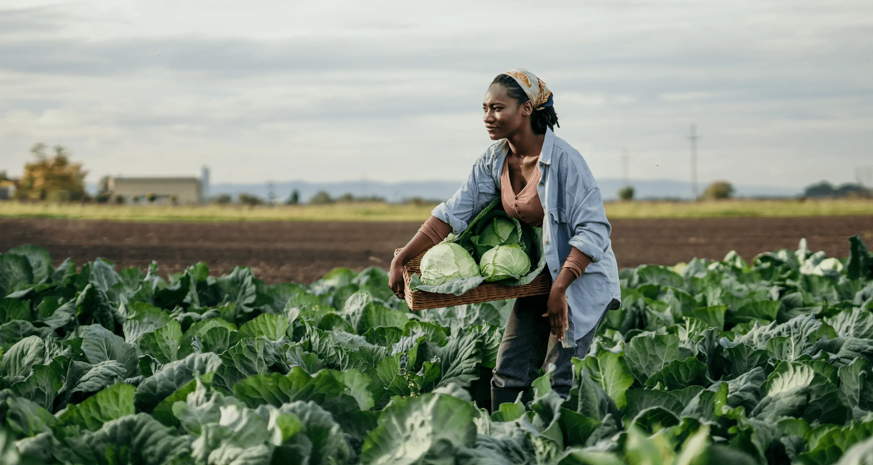
All graphic devices revolve around the shape of the logo, juxtaposing soft curvatures with deep blues and strong typography, creating a bold, yet inviting visual system. The logo shape is used in multiple ways to frame typography and mask imagery, but primarily used as a framing element surrounding the main individual in a photo. This framing shows a layering where the logo shape is seen at times in front and behind the individual, implying that no matter the job Border States is with you. The logo shape is also used in a pattern where multiple logos are stacked horizontally and vertically, creating a postage stamp like effect, representing all of the employees-owners who work together to make Border States what it is.
As one of America's largest 100% employee-owned companies the colour palette relies on multiple blues, red and a lot of whitespace to reflect back its American roots.
/ A unified design system for scale
After finalizing the visual system, the elements were added to a brand new design system, which was made to enable brand alignment across multiple properties, creating a unifying system that enables consistency at scale. Ever-evolving, the component library is flexible and allows for adaptability to any changing priorities with the ability to be modified, added or removed from the library as needed. This flexibility ensures that Border States' visual system is recognizable in any framework and guarantees a more cohesive user experience regardless of platform.
/ Systems for consistent implementation
The final visual and design systems created provide all the details to apply the elements of the brand across multiple applications ensuring easy brand recognition, consistently and efficiently.
Other
Projects


Get in touch